- The Filters
- The view
- Analysis tools
This page allows you to analyze the buying behavior of your viewers and to know their preferred moments of purchase. These analyses will help you to determine, among other things, the times at which your communications are sent so that they correlate with the buying habits of your audiences. You can also determine your audiences' preferred arrival times to help you better prepare in advance.
1. The filters
You will find a detailed definition of all filters at the beginning of this article.

2. The view

These parameters determine which data you will be able to analyze in the graphs below:
| View type | According to the selected field (by date of purchase or by date of performance), the graph will represent respectively the preferred moments of purchase of your spectators or their preferred moments of visit. |
| Group by | determines the values on the x-axis. You will have the choice between the hours of the day, days of the week or months of the year. |
| Indicator | Determines the y-axis value. You can choose between the number of tickets sold, the turnover or the average price. |
| Value |
Determines the calculation method used to display the values in the table. You can choose to display the cumulative total of tickets, the average per event or the average per performance. |
| Period | Determines the period over which you wish to perform your analysis. |
You can cross-reference all of these parameters to perform your analyses. Once your filters are defined, we invite you to click on Validate.
3. The analysis tools
You have at your disposal several analysis tools: a graph, pie charts, a heat chart and a sales distribution table during the day.
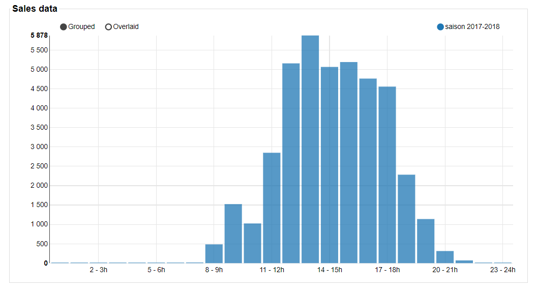
1. The graph
This graph is a histogram to represent the distribution of the data parameterized in the filters. Feel free to move your mouse over the elements of the graph to see the value of each of them.
2. Pie charts
These pie charts show the distribution of sales by sales channels and by category according to the filters you have selected.

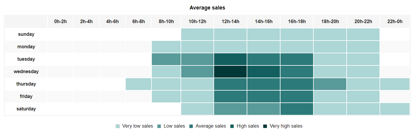
3. The heat chart
This table allows you to cross the days of the week with the hours of the day in order to have a precise vision of the preferred moments of purchase or arrival of your spectators. The darker the chart, the higher the number of sales.
We advise you to select the filters corresponding to your online sales in order to determine the preferred moments of purchase of your online buyers to adjust the sending of your emailing campaigns.