- Filter
- The view
- Sales curves
- More information
Within the Sales tab, the Charts page allows you to display your sales and their evolution through different charts. Below is a detailed overview of the page’s features: filters, view, sales curves, and additional information.
1. Filters
Filters are used to determine which elements you can analyze in the following sections. They help you to refine your analyses and to have a precise vision of the evolution of your sales on a defined parameter. Please note that it is possible to cross-check several filters and display several elements in a single filter.

We will review all the elements we can filter.
| Type of events | If you have set up event types, you will be able to analyze the evolution of your sales on the whole of this typology. |
| Venue | If you organize events in several different locations, this will allow you for example to display the sales curve of one or several locations in particular. |
| Season | The season allows you to refine your analysis over one or more seasons. |
| Event | You can also choose to focus your analysis on one or more events. |
| Performance | Similarly, you can choose to display a result for one or more performances for a particular event. To do this, you must have selected an event beforehand. |
| Sales channel | This filter is interesting if you want to display only the sales made online or at the counter, for example. |
| Type of categories | If you have set up category types, you can specify your analysis on one or more category types. |
| Category | You can choose to display one or more categories. |
| Type of pricing formulas | If you have set up price formula types, you can specify your analysis on one or more price formula types. |
| Pricing formula | You can choose to display one or more price formulas. |
| List | This filter allows you to analyze sales for a specific type of audience. |
| Ticket status | There are several possible ticket statuses: sold, reserved, cancelled and refunded. By default Arenametrix displays sold tickets, but you can for example choose to add reserved tickets. |
We invite you to cross-reference all these elements to have precise and interesting data to exploit! For example define a specific event and the sales channel for online purchases. When your filters are chosen, don't forget to click on the Validate button in order to display the chosen elements.
2. The view
In the View section, you can define the display mode and period.
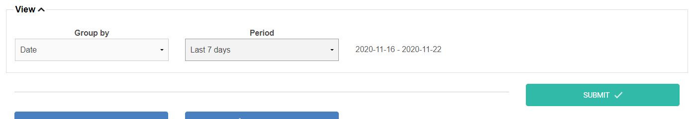
The display mode is determined by the Group by function. You can choose to group by Sales dates or Days before performance:
-
Sales dates: allows you to evaluate the overall evolution of sales since the selected events were put on sale.
-
Days before performance: allows you to analyze the sales curve leading up to an event performance. This feature is particularly useful for observing how sales evolve in the final days before the performance date.
In addition, the Period function allows you to define the timeframe for your analysis.
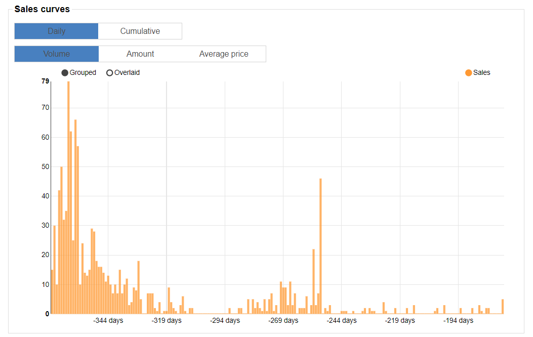
3. Sales curves
The Sales curves section displays a histogram of your sales per day over the selected period. It allows you to quickly visualize the evolution of your sales, purchase lead times before the performance, or sales peaks linked to your communications.
You can display the histogram using different modes: Daily or Cumulative. You can also define the value on the vertical axis: ticket volume, total revenue, or average price. Finally, you can hover over a bar to display details, such as the number of tickets sold on a specific day.
4. More information
This additional information is located to the right and below the histogram. As with the chart, the results are determined by the filters you previously selected at the top of the page.
On the right side of the histogram, you will find the revenue generated, the number of tickets sold, the average price, and information related to the average basket.

Below the histogram, you will get an overview of your sales channels, categories, and price formulas through pie charts.
